Insights from the Web Directions AAA 2021
Access All Areas (AAA) is a 2-day online conference published and organised by Web Directions. It is part of a series that covers CSS, Progressive Web Apps (PWAs), JavaScript performance and accessibility – a topic that is becoming more and more important, especially with the ever-increasing digitalisation of our everyday lives.
Sara Soueidan, who herself is very committed to accessibility on the web, was in charge and moderated the event. Her compilation of the lectures positively surprised us: it was not the normal filling of slots. No, all the talks were selected in such a way that they perfectly built on each other.
Accessibility APIs
Adem Cifcioglu started with a talk on Accessibility APIs. First he explained in detail the Accessibility Tree, which is structured as follows:
- Name
- Roles
- States
- Properties
- Relationship
Such a tree contains the contents of an element, the attributes and associated elements as well as the ARIA attributes. However, elements such as button, checkbox, img etc. are not included. In addition, elements can be hidden with aria-hidden="true".
OS Accessibility APIs and Viewers
- Windows
- MSAA/IAccessible2 and UI Automation with Accessibility Insights
- MacOS
- NSAccessibility with Accessibility Inspector for OSX
- Linux/Gnome
- Accessibility Toolkit and Assistive Technology Service Provider Interface
- iOS
- UIAccessibility with Accessibility Inspector for iOS or Safari DevTools
- Android
- AccessibilityNodeInfo and AccessibilityNodeProvider with Chrome DevTools
Semantics
Hidde de Vries explained that HTML does not make statements about the appearance of the page but rather defines the meaning. The semantics in HTML are defined in elements, attributes and values: <elements attributes="value">. HTML also makes no statement about how certain elements should be used. For example, filling out a form can be done by having the browser automatically fill in known fields or by using other assistive technologies such as voice input, etc. However, there are several ways to express the same semantics, e.g. <button> or <div role="button">. You can find more information on how to use HTML semantics in the specification. And some examples of how not to use HTML have been collected in HTMHell.
| CSS | <table> etc. | <ul>, <ol>, <dl> | <h#> | <button> |
|---|---|---|---|---|
| display: flex | ❌ | ✅ | ✅ | ✅ |
| display: grid | ❌ | ✅ | ✅ | ✅ |
| display: block | ❌ [1] | ❌ [2] | ✅ | ✅ |
| display: inline-block | ❌ [1] | ❌ [2] | ✅ | ✅ |
| display: contents | ❌ [1] | ❌ [2] | ❌ | ❌ [3] |
| [1] | (1, 2, 3) treats all cells as a column |
| [2] | (1, 2, 3) recognises dl everywhere |
| [3] | is still triggered when double-clicking |
In addition, lists can lose their semantics if list-style-type: none is set; see also "Fixing" Lists. Other CSS instructions, such as text-transform: uppercase, are interpreted by some screen readers as abbr. More CSS instructions that influence screen readers can be found in CSS Can Influence Screenreaders.
Hidde de Vries ends his talk with a quote from the Open UI organisation:
„We hope to make it unnecessary to reinvent built-in UI controls“
– Open UI
Other goals of Open UI are:
- Component names of documents, as they already exist today
- A common language for describing user interfaces and design systems
- Browser standards for components of web applications
ARIA standard
Gerard K. Cohen gave an introduction to Accessible Rich Internet Applications (ARIA) and showed how the ARIA specification can be used to create custom-fit components. At the beginning of his presentation, he warned of the dangers that ARIA can bring with it. For example, after analysing one million websites in February 2021, WebAIM concluded:
„On homepages with ARIA, on average 41% more errors were detected than on those without ARIA!“
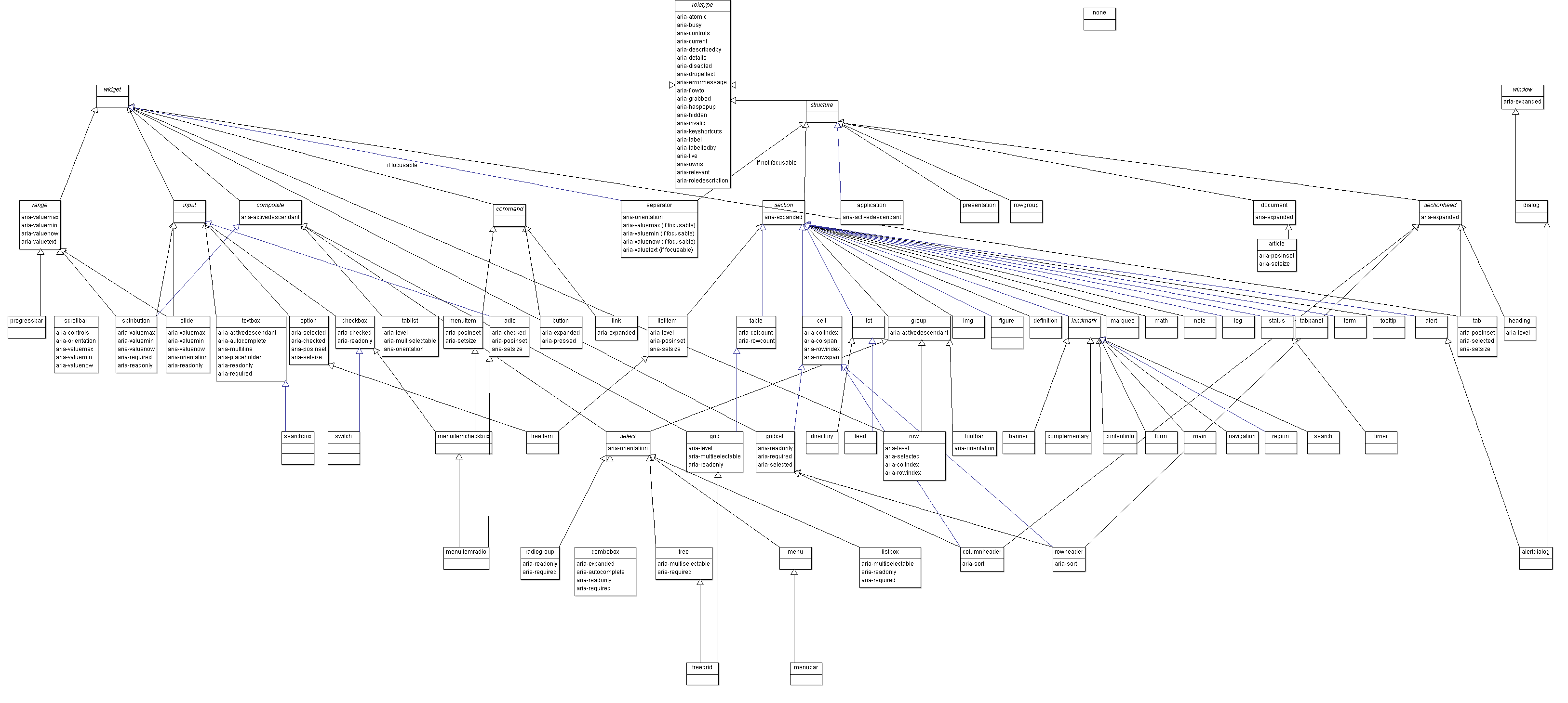
However, the standard is not easy to keep track of, with 70 ARIA roles and 29 interactive (widget) roles:
In addition, ARIA roles do not offer any interactions by themselves, but only describe states and properties that can then be used to define interactions themselves.
Therefore, he strongly advised to follow the five ARIA rules:
Do not use ARIA if you can use HTML instead.
Don’t change the original semantics, e.g., don’t
<a href=“#” role=“button”>Menu</a>
All interactive ARIA roles must be operable with the keyboard.
Do not use role="presentation" or aria-hidden="true" for visible, focusable elements.
All interactive elements must have an accessible name.
Finally, he pointed out the guidance in the Browser and Assistive Technology Support section:
„It is important to test the interoperability of assistive technologies before code … is used in production.“
He also referred to another quote from Mobile and Touch Support:
„Currently, this guide does not specify which examples are compatible with mobile browsers or touch interfaces. While some of the examples include specific features that improve support for mobile and touch interfaces, some ARIA features are not supported by all mobile browsers. In addition, there is not yet a standardised approach to providing touch interactions that work in all mobile browsers.“
Live Regions
Ugi Kutluoglu explained the problems that Live Regions solve and the misconceptions that need to be addressed. Essentially, they are DOM nodes that are intended for notifications and control screen readers mostly via JavaScript.
A Live Region can be easily deployed anywhere in the DOM before content is added:
<div id=”myLiveRegion” class=”visually-hidden”> </div>

<div aria-live=”polite” aria-relevant=”text” aria-atomic=”true” id=”myLiveRegion”>
    <span>Now playing</span>
    <span id=”song”>Van Morrison - Celtic New Year</span>
</div>
Common mistakes are
- trying to create a language interface
- the assumption that everything is announced in a known way
- assuming that whole sections will become live
- competing live regions
- attempts to communicate the status of live regions
- too many updates in too short a time
To be able to analyse these errors, he presented various debugging tools:
Add a break on subtree modifications to see what gets added, when and by which script
Mutation Observer
(()=>{
    const target = document.querySelector('body');
    const observer = new MutationObserver(function(mutations) {
        mutations.forEach((mutation) => {
            console.log(mutation.addedNodes, mutation.removedNodes, mutation.attributeName)
        });
     });
    observer.observe(target, {childList: true,attributes: true,subtree: true});
})();
High contrast mode
Kilian Valkhof made it clear right at the beginning that this mode does not directly lead to higher contrasts but rather reduces the number of colours and that the colours can be selected by the viewer. This makes it easier for people with impaired vision, colour blindness and sensitivity to light, but also in bright sunlight etc., altogether about 4% of those who want to look at a website.
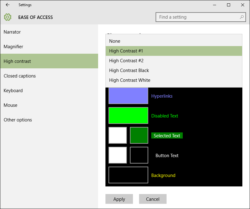
After selecting an option, the Windows High contrast page displays a preview.
Media queries
Typical media query statements might look like this:
@media (forced-colors: active) {
}
@media (prefers-color-scheme: dark) {
}
@media (prefers-color-scheme: light) {
}
Tips
You should note that you do not usually visualise meanings using colours alone, see Better Form Design.
Alternatively, you can force the colours you have defined to remain:
element {
  forced-colors-adjust: none;
}
For images, you should specify a dark and a light mode in the <picture> tag and in SVGs a <style> element.
For focus elements, the colours selected in high-contrast mode should also be displayed, if necessary. For example, outline: none; should not be used but instead:
element:focus {
  outline-color: transparent;
  box-shadow: 0 0 0 2px orangered;
}
Colour contrast and WCAG
- Todd Libby’s presentation was really about colour
- contrast and how to meet the WCAG 2.0 success criteria. He illustrated this with some success criteria:
- Success Criterion 1.4.6 Contrast (Enhanced) (AAA)
The visual representation of text and text in images shall have a contrast ratio of at least 7:1 except for the following:
- Large text and images with large text have a contrast ratio of at least 4.5:1
- Incidental text and text in images that are part of an inactive component of the user interface, or that are purely decorative, or that are not visible to visible to anyone, or that are part of an image that includes significant other visual content, do not have contrast requirements.
- Logotypes, text that is part of a logo or brand name, does not have to have contrast.
- Success Criterion 1.4.11 Non-text Contrast (AA)
The visual representation of the following components shall have a contrast ratio of at least 3:1 to adjacent colours:
- User interface components
- Visual information required to identify user interface components and states of the user interface, except in the case of inactive components or if the appearance of the component is determined by the user agent and not changed by the author.
- Graphical objects
- Portions of graphics that are necessary to understand the content, unless a particular representation of graphics is essential to the information to be conveyed.
Unfortunately, colour contrasts are still one of the most common errors on websites in 2021 in terms of accessibility:
86.4% of homepages contained low-contrast text, an average of 31 instances per homepage.
– WebAIM Million – 2021 Update
Thereby there are several tools that can be used to check colour contrasts:
- contrast ratio
- Who can use
- Contrast Checker
- Colour Contrast Checker
- Randoma11y
- Button Contrast Checker
There are also several browser extensions available:
And entire colour palettes can also be tested:
Finally, he gave the tip that colour ratios should keep to the minimum contrasts, but at the same time too strong contrasts in the text can lead to a blurred perception.
Accessible SVGs
Heather Migliorisi reported on scalable vector graphics (SVG), which are increasingly becoming the preferred graphics format on the web. This also has an impact on assistive technologies. Her 2021 updated article Accessible SVGs describes in details the topics of her talk, so we don’t need to summarise it here ourselves. However, she recommended a few additional sources:
- Carie Fisher: Creating Accessible SVGs
- Sara Soueidan: Accessible Icon Buttons
- An alt Decision Tree
- Sarah Higley: Quick Tips for High Contrast Mode
- Melanie Richards: CurrentColor SVG in forced colors modes
- Val Head: Designing With Reduced Motion For Motion Sensitivities
Making movement inclusive
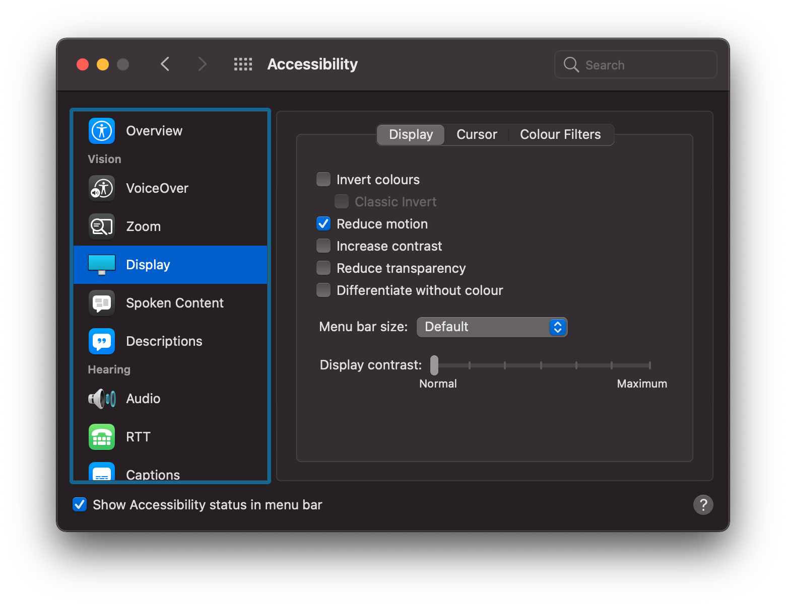
Val Head emphasised the preference for reduced movements:
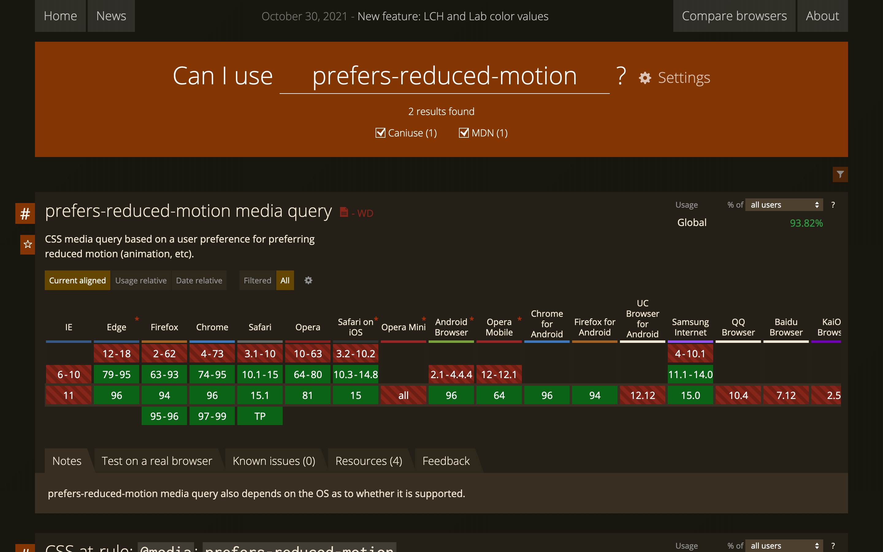
Most of the browsers n use also support the Media Query prefers-reduced-motion:
The media query can be implemented in CSS as well as in Javascript:
@media (prefers-reduced-motion: reduce) {
}
const motionQuery = window.matchMedia('(prefers-reduced-motion)');

if (motionQuery.matches) {
    document.documentElement.classList.add('reduced-motion');
}

motionQuery.addListener(handleReduceMotionChanged);
handleReduceMotionChanged();
She then showed how interface animations can be designed accordingly. Among other things, she showed Animation with reduced-motion by Marcy Sutton.
For more information on the preference for reduced motion, see her book Designing Interface Animation, the WebKit article Responsive Design for Motion and her article Designing With Reduced Motion For Motion Sensitivities.
Get in touch
In our training courses, we give a practical introduction to the appropriate technologies for accessible websites. We will also be happy to provide you with an individual offer for the development of your style guide or your frontend, into which we will integrate the latest findings.
I also like to call back!

